Welcome to August! How in the world did summer fly by that quickly?!
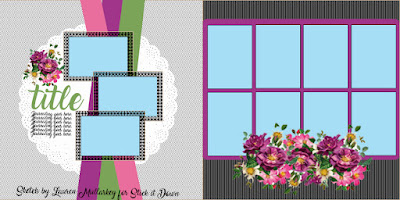
To brighten up your Monday, here is our design team's take on our double page sketch!
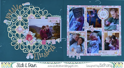
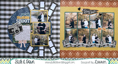
My layout is showcasing my sweet niece Natalie's arrival last February! I used a cut file instead of a doily for the left page, but then had fun making a similar collage on the right side.
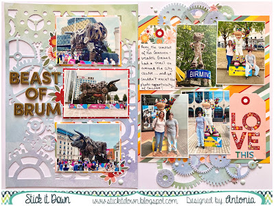
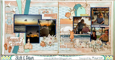
I adapted the sketch from 12x12 to A4 format, and used a rectangular cutfile instead of a circular shape for the background on the left side. As the two sides were quite different in theme and design, I used elements from one side to cross them over to the other, and vice versa, to create cohesion between the two pages.
We hope you're inspired by our double teams sketches this month! Play along for your chance to win and be our next Guest Designer! :)

No comments:
Post a Comment
Thank you for stopping by to visit us at Stick it Down! We love having you.