Thanks for stopping by today!
Pages
▼
Friday, April 24, 2020
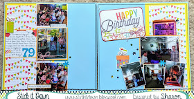
card team member takes on the double page sketch!
Today we have a special treat! Card design team member, Sharon, has made a page to share using our double page sketch!
Thanks for stopping by today!
Thanks for stopping by today!
Monday, April 20, 2020
April card team!
Handipaper is a digital craft store, where you will find
printables, clipart sets and a wide variety of digital cutting files for
scrapbookers, cardmakers and DIY lovers.
Leslie
Alison
One randomly selected winner will receive a prize from Handipaper Etsy shop! We'll also choose one winner from each sketch to be a guest designer!
Alison
You have until the end of the month to play along with any - or all! -
of our sketch challenges. Just post a link to your creation in our
sidebar. If you share on social media, be sure to tag #StickItDown.
One randomly selected winner will receive a prize from Handipaper Etsy shop! We'll also choose one winner from each sketch to be a guest designer!
Friday, April 17, 2020
single page guest post by Neva!
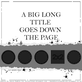
I am excited to give a single page layout a sketch with our team over at Stick It Down.
I had just two photos printed from an event and decided this would be a
great way to showcase them since a long title was perfect for the
layout.
My version is from a fall event, and the colors are very vibrant for the season.
My version is from a fall event, and the colors are very vibrant for the season.
- The Quick Quotes Autumn Brilliance Collection was perfect, I used I used two sides of one paper and one side of two more of the collection.
- A Plaid ruler for tearing paper made quick work of tearing the edges.
- During the quarantine I am learning how to use my Brother ScanNCut and Canvas Studio. It was easy to create my own wavy edged circle frames.
- The title font is a Silhouette font, ZP Whiplash.
Monday, April 13, 2020
April single page team!
Handipaper is a digital craft store, where you will find
printables, clipart sets and a wide variety of digital cutting files for
scrapbookers, cardmakers and DIY lovers.

Laura
Lisa
Melissa Kay
One randomly selected winner will receive a prize from Handipaper Etsy shop! We'll also choose one winner from each sketch to be a guest designer!
process video HERE
Lisa
Melissa Kay
You have until the end of the month to play along with any - or all! -
of our sketch challenges. Just post a link to your creation in our
sidebar. If you share on social media, be sure to tag #StickItDown.
One randomly selected winner will receive a prize from Handipaper Etsy shop! We'll also choose one winner from each sketch to be a guest designer!
Friday, April 10, 2020
April guest designer!
Please welcome Susan!
I'm an architect (and Star Wars fan) from Flemington, NJ and married to
an amazing, patient husband who encouraged me to share our dining room
space with my art supplies in our small circa 1889 Victorian house. We
are blessed with two wonderful boys and I love to document our family
through scrapbooking, because it provides me a way of getting some
satisfaction organizing our photos and memories while simultaneously
creating some personal artwork.
My
springboard inspiration for this challenge was the large photo. It's
not often that I need to incorporate such an enlarged photo into my
scrapbooks. The first image I thought of is a favorite of mine from
2019; a formal photo of my sister-in-law and her niece and nephews at
her wedding. There was so many great moments to document from this much
anticipated family event that I've had trouble motivating myself to jump
into this project for over a year. So, this challenge was my excuse to
get it started!
At
first I put the circular patterned paper where the sketch shows the
triangular pattern, thinking that was a geometrically similar. I knew I
wanted to use horizontal stripes to subtly reference the old barn walls
in the photos somewhere, and after trial and error I decided to reverse
the locations of the circular and striped patterns, putting the bolder
pattern in the center and focus on highlighting the title. I'm not a
pocket scrapbooker, but I was gifted a small tile card set, that just
happened to be a wedding theme. The patterned black and white graphics
worked well with the Valentine's Day paper, so I'm looking forward to
incorporating more of that set on future layouts for this project.
I
don't own a Cricket, so most of my titles are handmade. I've used this
technique creating a banner connected with braided bakers twine in the
past. I didn't have any really large alphas to use that worked so
decided I would use a different font for each word in the tile, varying
sizes to capture the spirit of the sketch. I love incorporating metal,
grommets, wood and fibers.
Finally,
I used embellishments to highlight the soft teal blues and burgundy in
the papers. I've been experimenting more and more with pastes and gels
on my layouts lately, and took this opportunity to use a new stencil to
ground the photos more. I really like the stencil's bold graphic and how
it compliments the circular paper pattern.
To read more about Susan's page, visit her BLOG.
Thursday, April 9, 2020
March winners!
I apologize for the delay in announcing winners this month. I'm an "essential" employee and I have been very busy. Thank you to everyone who played along with our sketch challenges last month. Without further ado, here are our March winners!
and our randomly selected prize winner... Leanne!
Congratulations everyone! Please email Ashley at StickItDownChallenges@gmail.com
and our randomly selected prize winner... Leanne!
Congratulations everyone! Please email Ashley at StickItDownChallenges@gmail.com
Monday, April 6, 2020
April double page team!
Handipaper is a digital craft store, where you will find
printables, clipart sets and a wide variety of digital cutting files for
scrapbookers, cardmakers and DIY lovers.

Sharon

You have until the end of the month to play along with any - or all! -
of our sketch challenges. Just post a link to your creation in our
sidebar. If you share on social media, be sure to tag #StickItDown.
One randomly selected winner will receive a prize from Handipaper Etsy shop! We'll also choose one winner from each sketch to be a guest designer!
Thursday, April 2, 2020
Antonia takes on the April double page sketch!
Hi everyone, it’s Antonia here with a quick blog post to talk about sketches.
This month’s double page sketch is one that I made for the SID blog. I wanted to show you a number of ways I used this sketch to encourage you to allow sketches to inspire your creativity, rather than limit it.
The first layout is the one the sketch was based on. Accordingly, the two are very similar, practically identical. The second layout is a double layout in one of my ‘days out’ albums. The layout follows the sketch closely with the background papers and the positions of the embellishment clusters, but there is a marked difference here with the photos. On the left side, the single large photo is replaced with a collage of smaller photos. On the right, the two small photos stacked in a column are replaced by three photos arranged in a block.
The third photo is the least faithful interpretation of the sketch. The sketch here is flipped, by the way. These are two single layouts, but they both form parts of the same story. The main inspiration here from the sketch is how the photos are arranged on the pages – even though they are quite large photos, they allow the viewer to see the beautiful background paper. Even though the two layouts have completely different papers for the background, there is some cohesion achieved by using the same papers for layering and matting on both sides. There is no large title on these pages, instead more journaling was introduced – these changes were made to suit the purpose of the scrapbooker: to tell a story with words, as well as with photos.
The fourth photo goes back to follow the sketch a bit more closely: the placement of the background papers, the embellishment clusters, the large title and the journaling. The main difference here is the number of photos used on the right-hand side.
The last photo is a little challenge I set to myself. Why not use a double sketch for a single layout? As I only wanted to use two photos for this layout, I decided to just use one half of the sketch. I wanted layout 4 and 5 to look very similar, as they tell the same story, but for different people and in different albums. So, I used the same sketch, the same papers and similar embellishments for these layouts.
I love sketches, because I find them so very orientating. They come very handy when I have too many papers and embellishments to choose from, and my brain becomes incapable of making too many decisions… I am quite a stick-to-the-rules sort of person, so it took me ages to allow my creativity to guide my layouts, instead of making a perfect copy of a sketch. But now that I am able to allow my mood to take me to whichever direction it fancies, I would like to encourage you to embrace your creativity and use those sketches to suit your purposes!
Thanks for stopping by the SID blog today! You can see me talk a bit more about sketches and layouts in my process video HERE.
Don’t forget to keep popping back for loads more inspirations from our lovely and talented design team throughout the month! Happy scrapping, Antonia.
Wednesday, April 1, 2020
April sketch reveals!
Handipaper is a digital craft store, where you will find
printables, clipart sets and a wide variety of digital cutting files for
scrapbookers, cardmakers and DIY lovers.
 |
| Process video HERE & stay tuned in for tomorrow's post featuring Antonia! |
You have until the end of the month to play along with any - or all! -
of our sketch challenges. Just post a link to your creation in our
sidebar. If you share on social media, be sure to tag #StickItDown.
One randomly selected winner will receive a prize from Handipaper! We'll also choose one winner from each sketch to be a guest designer!


